The challenge
Underground music culture changes constantly — new venues, artists, and collaborations appear every week, making consistency difficult without losing spontaneity. The brief NOCTURNA set for itself was a flexible identity system that could adapt to different formats and campaigns while preserving a distinctive visual character.
The process
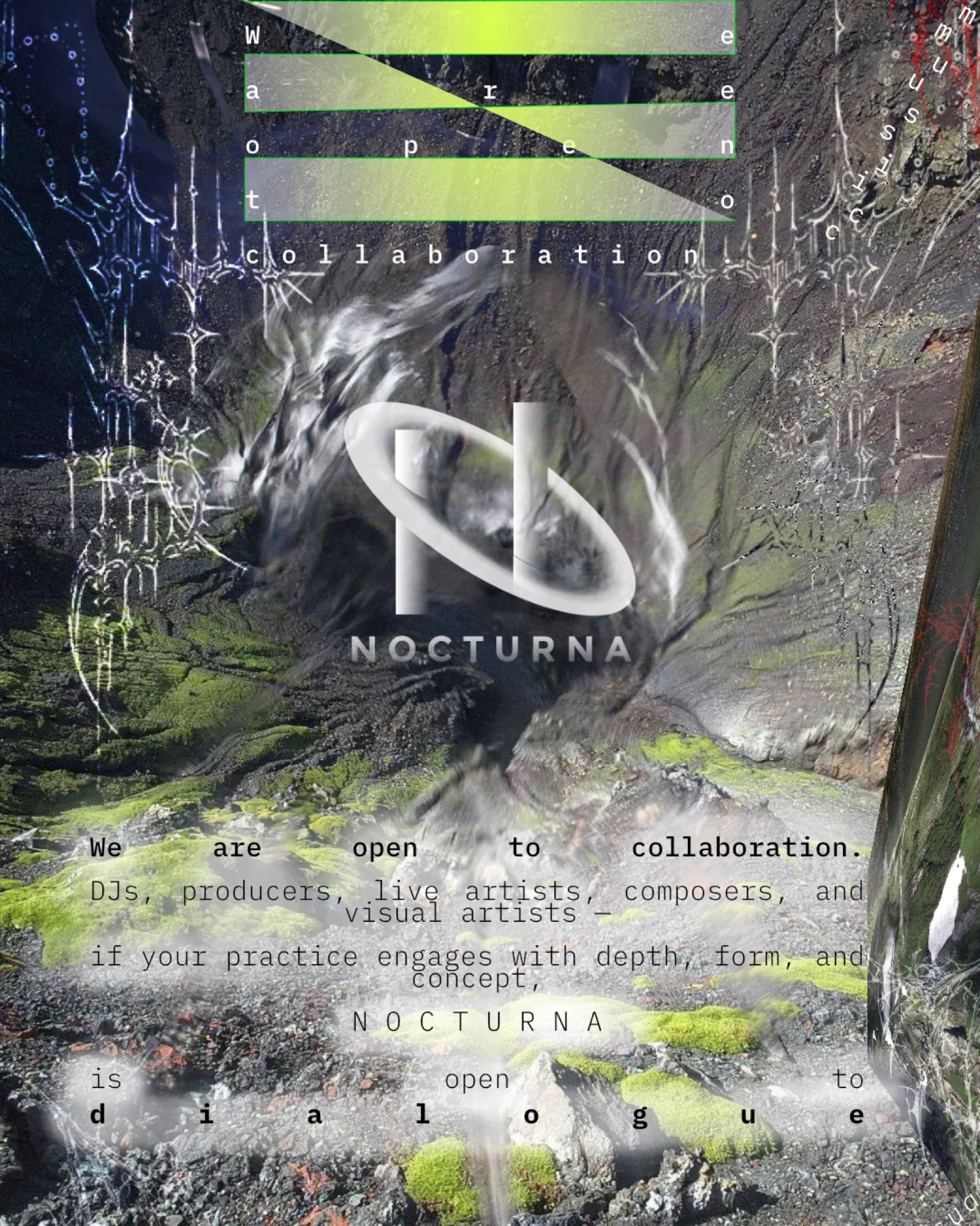
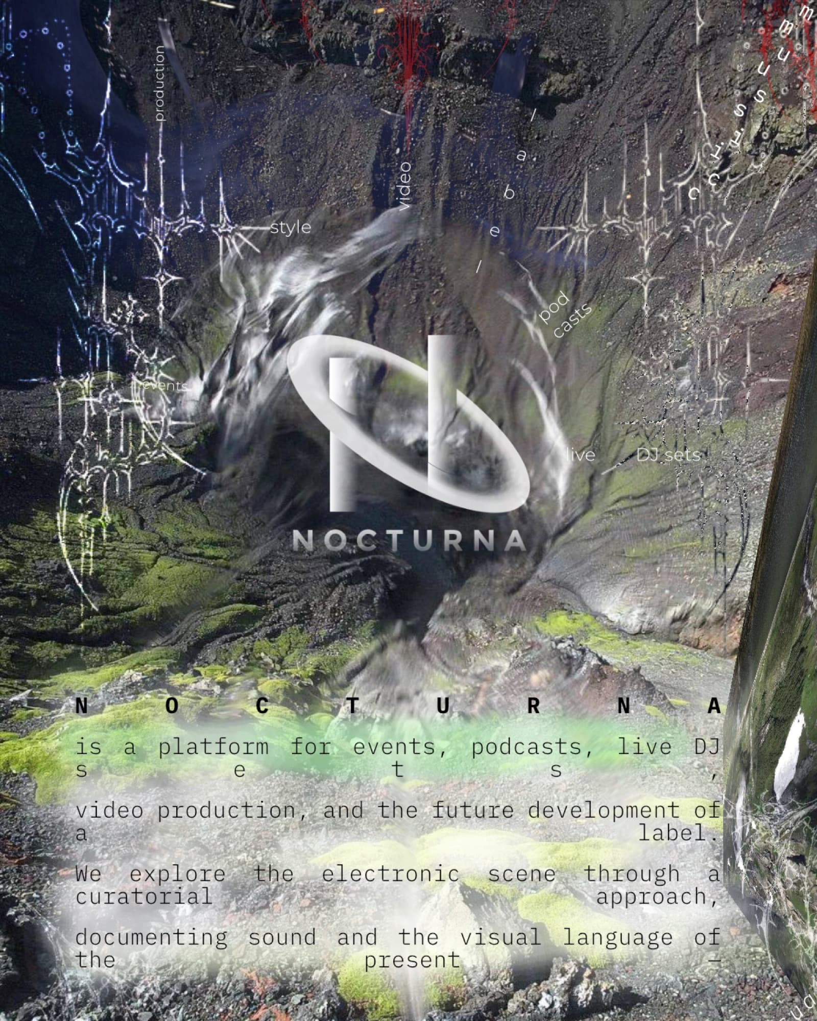
The project started with the NOCTURNA logo and the core visual language, then expanded into a growing collection of promotional materials — event posters, social graphics, and motion concepts. Editorial composition, experimental typography, chrome-inspired elements, abstract symbols, and a restrained palette were explored throughout. Each new design refined the system rather than reinventing it.
NOCTURNA Compass
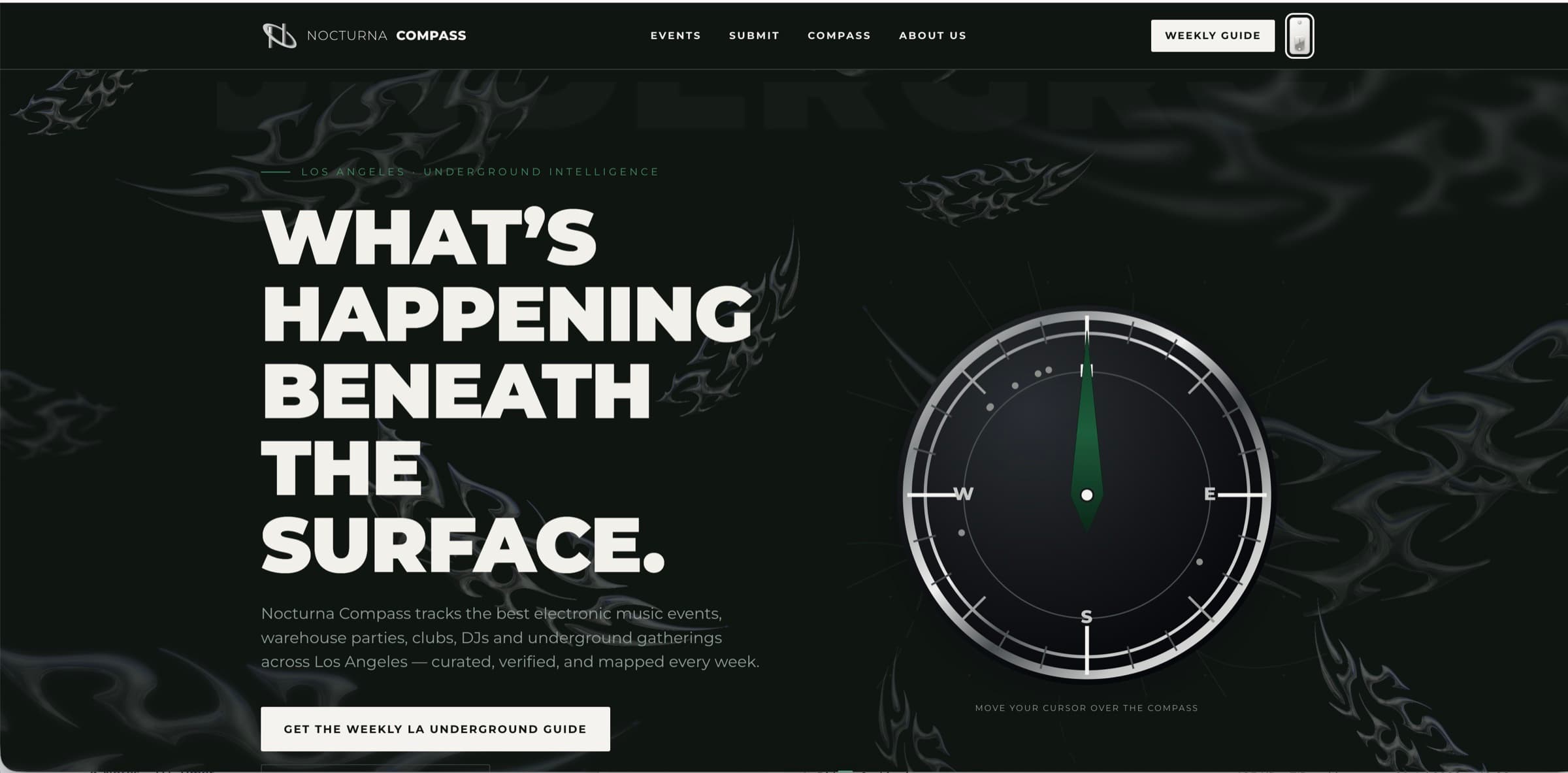
The next stage is NOCTURNA Compass, an interactive platform currently in development. Rather than a conventional event-listing site, it's conceived as a curated navigation system for underground culture — exploring how branding, interaction design, motion, and sound can work together as one immersive digital experience, and carrying the original identity into a new discipline. Beta screenshot below — designed end to end, currently in development.
System details

Artist announcements
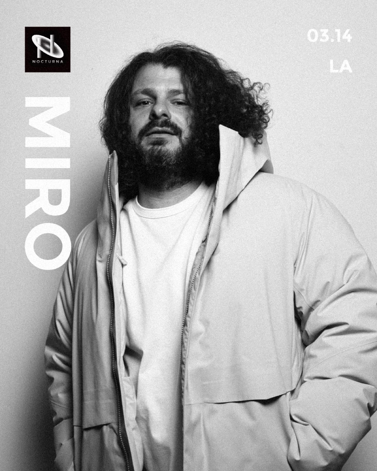
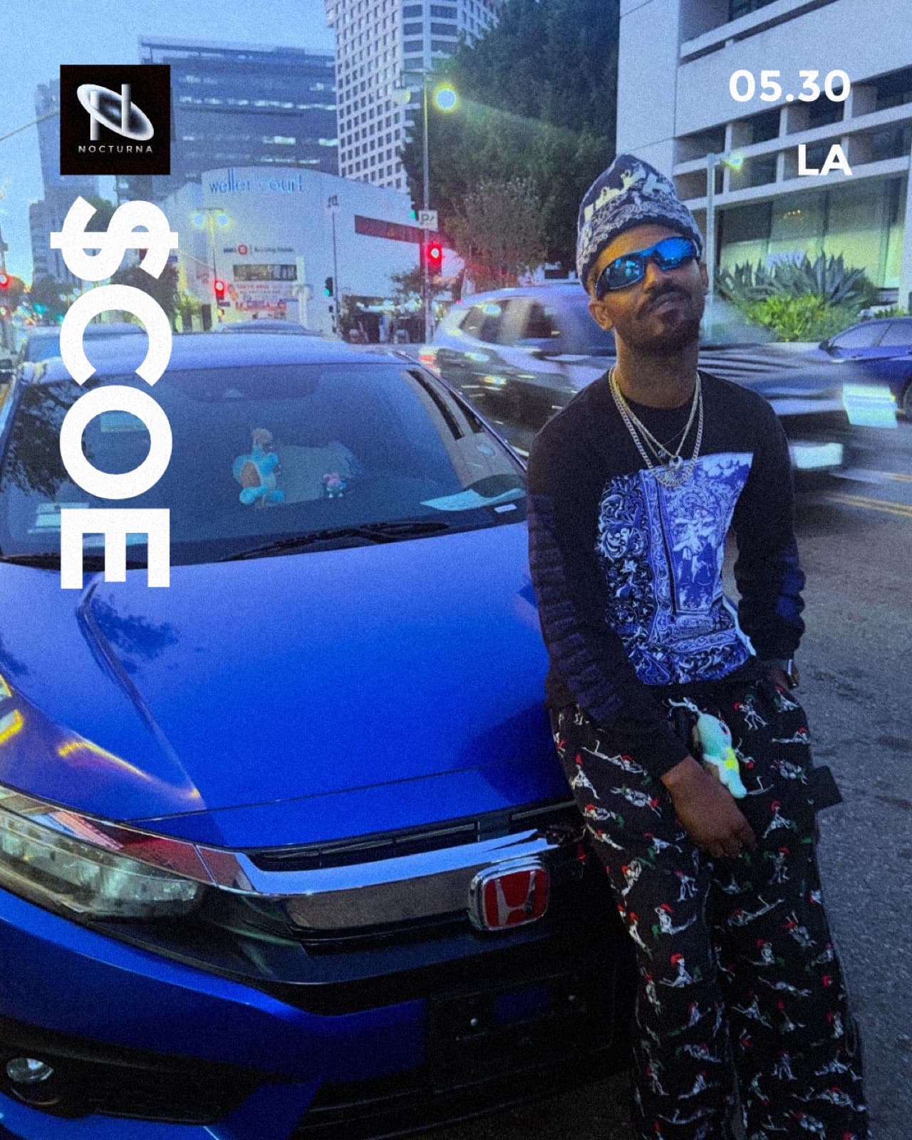
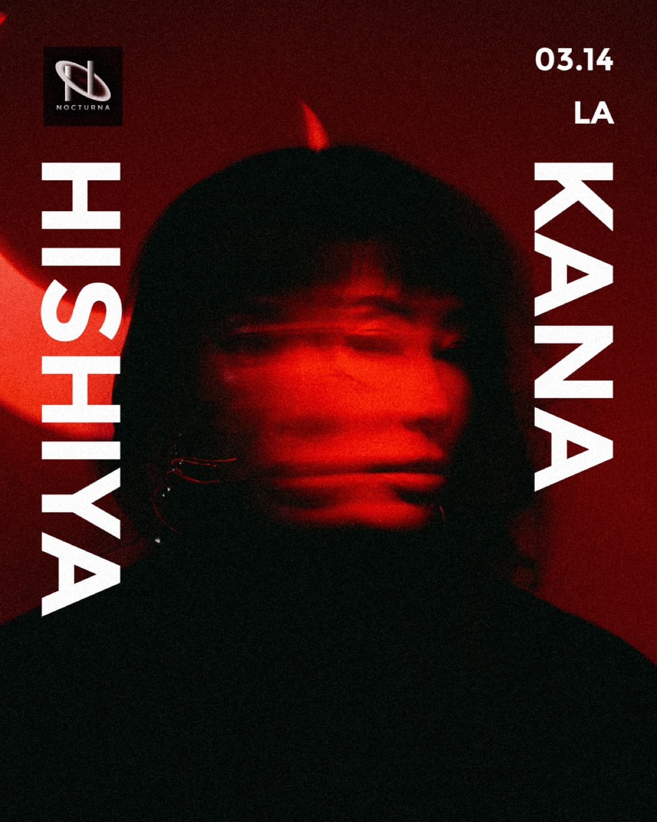
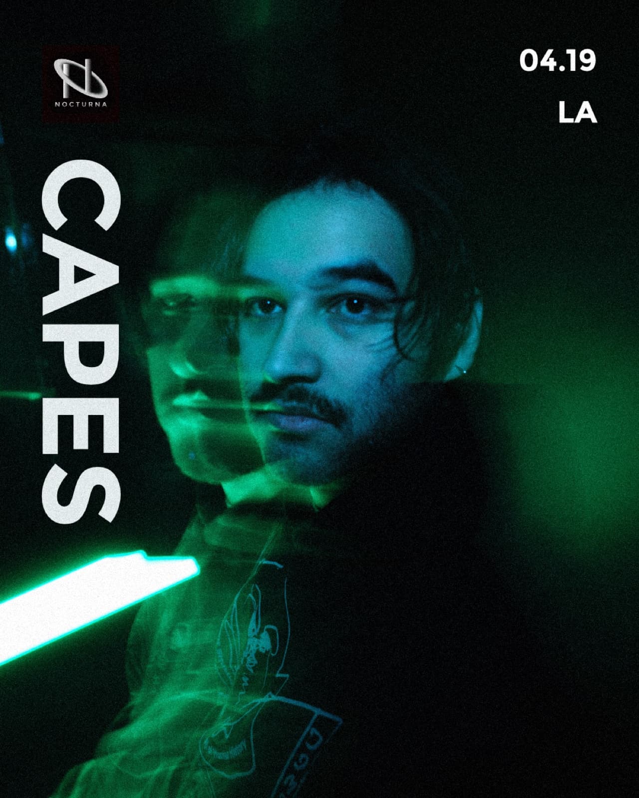
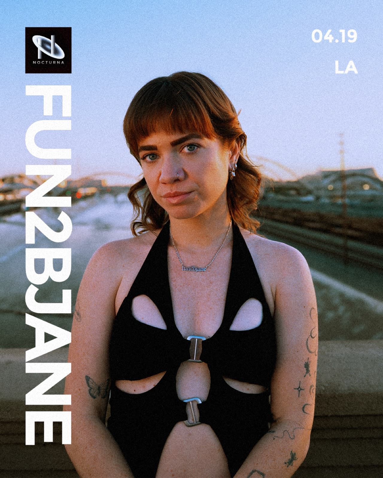
The same system applied to lineup announcements — logo mark, name, date, and city held to one consistent layout no matter who the artist is or what their own photography looks like.
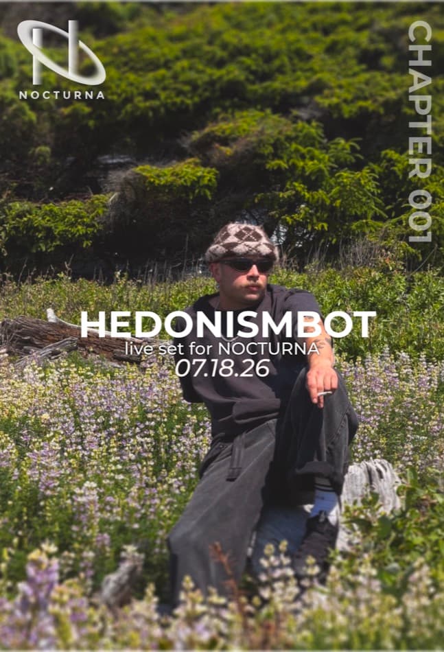
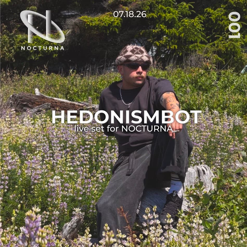
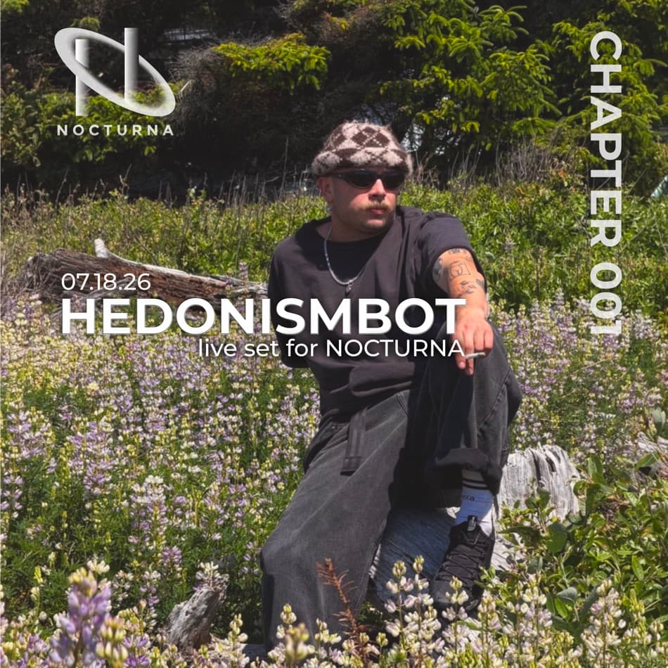
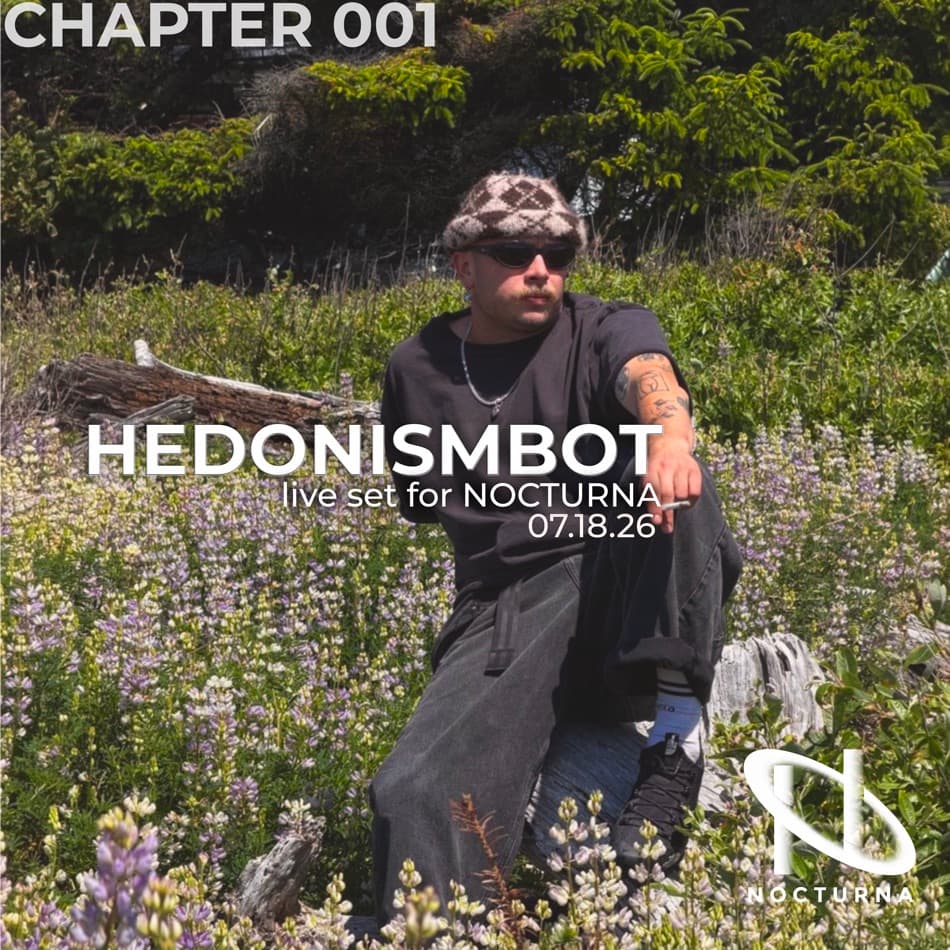
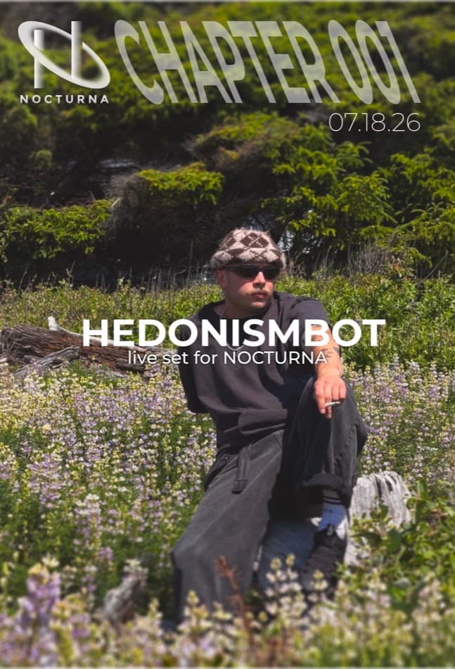
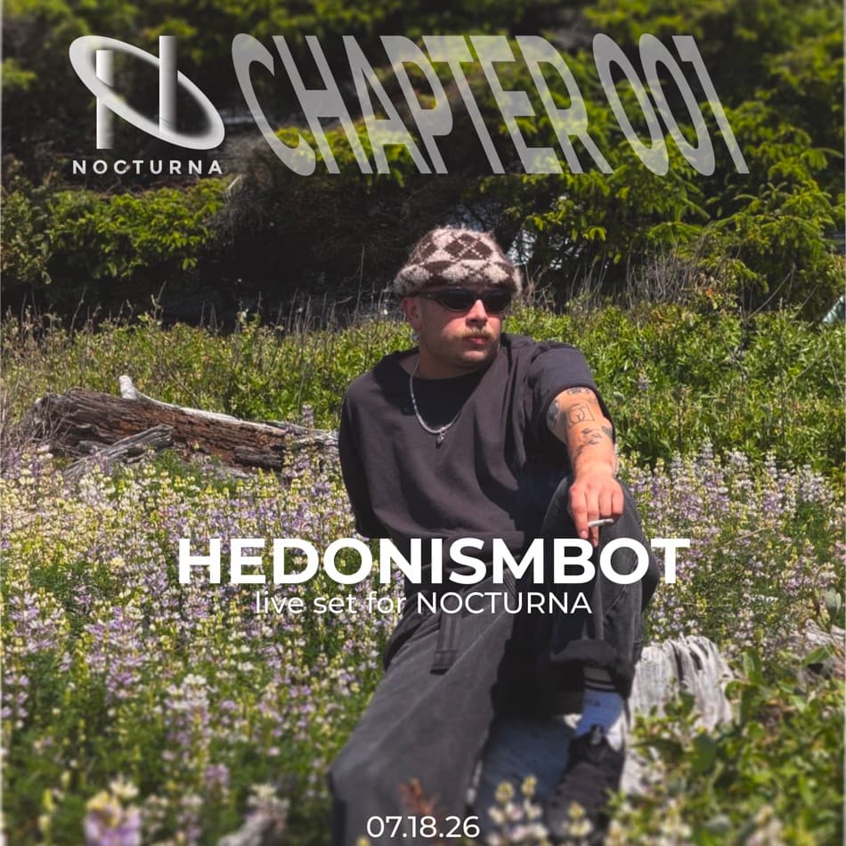
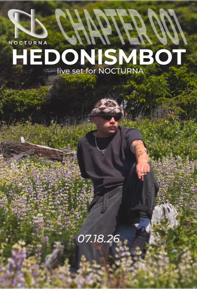
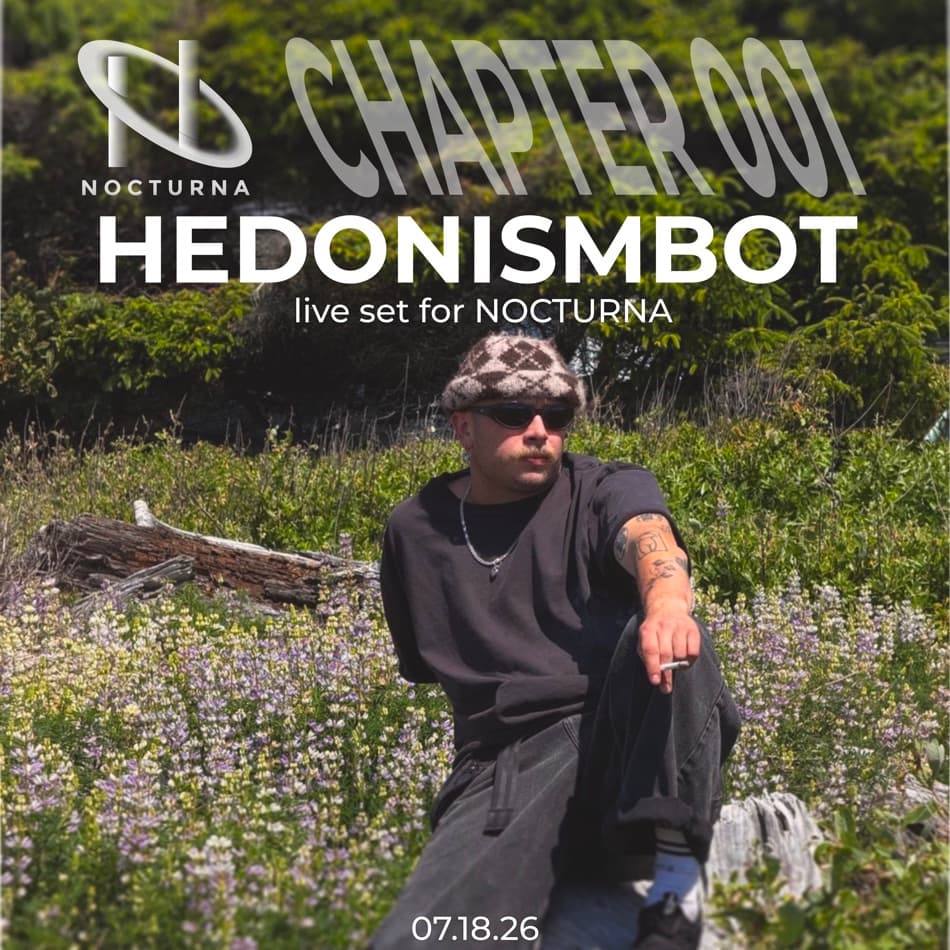
SoundCloud cover — layout studies
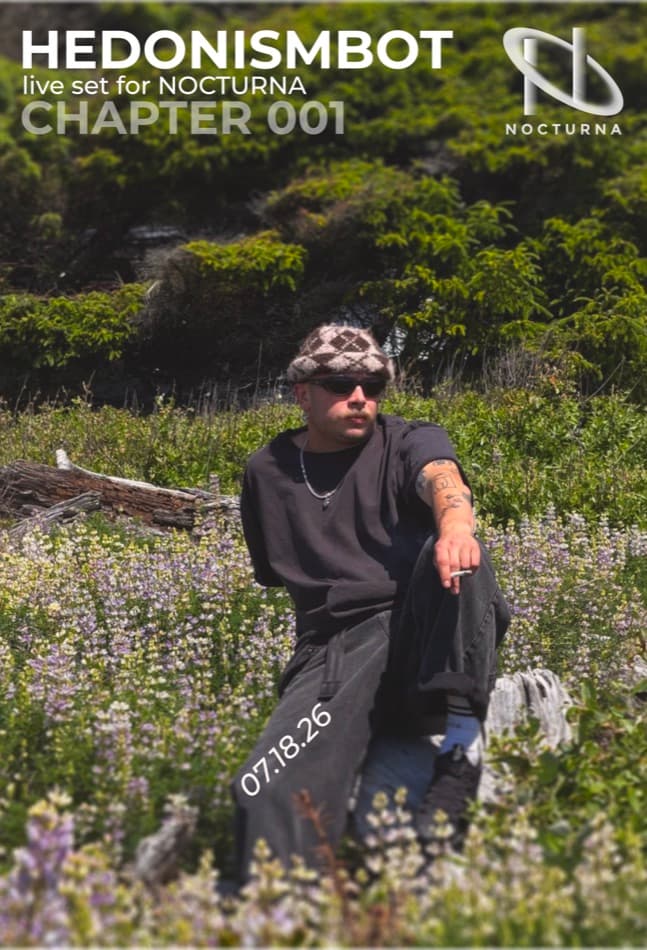
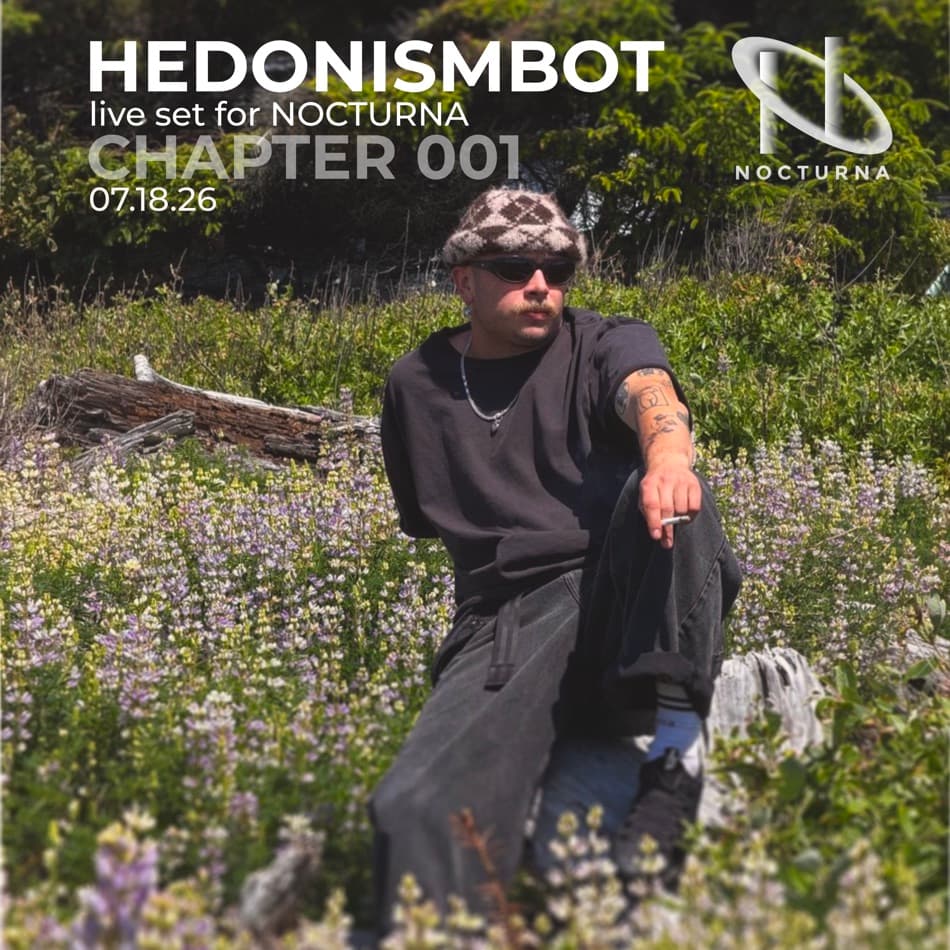
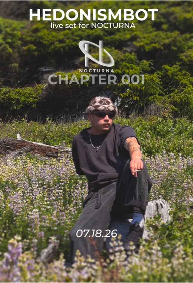
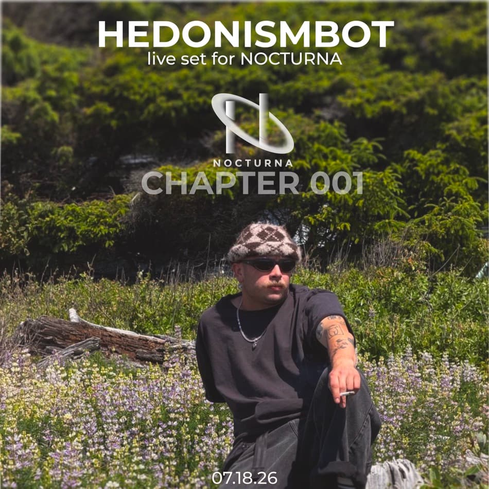
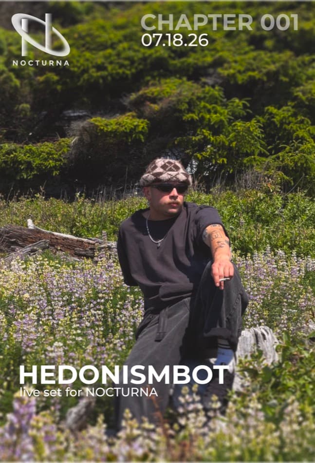
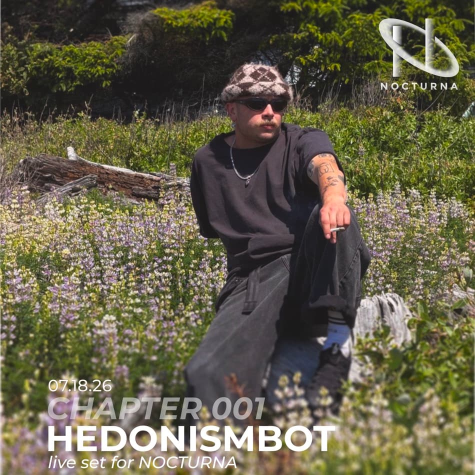
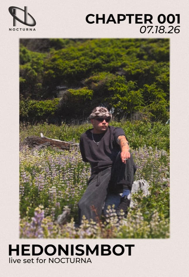
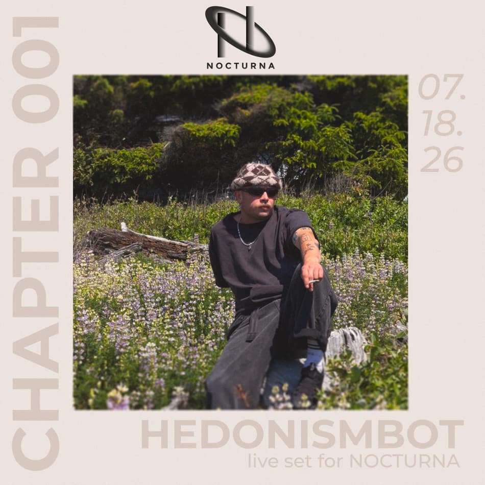
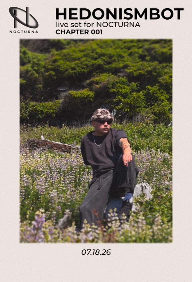
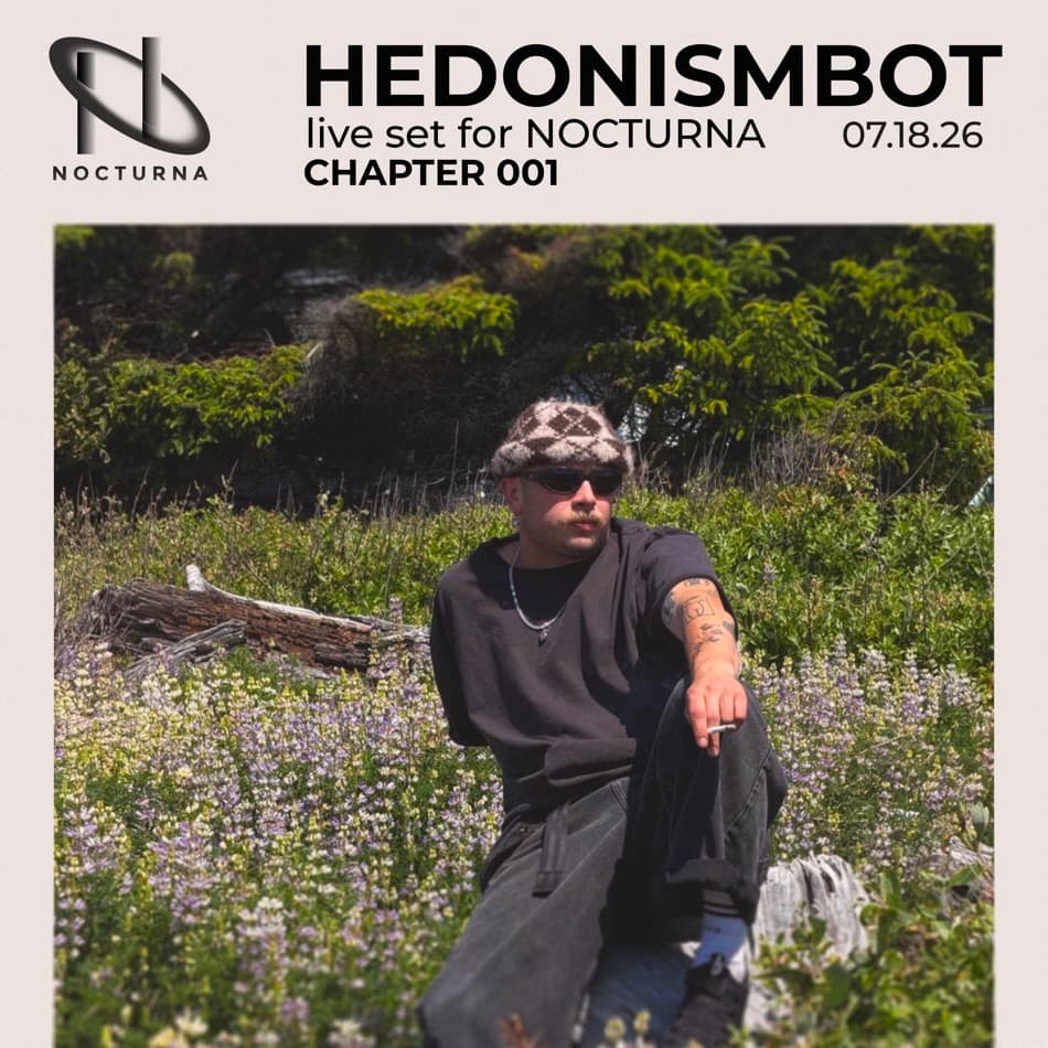
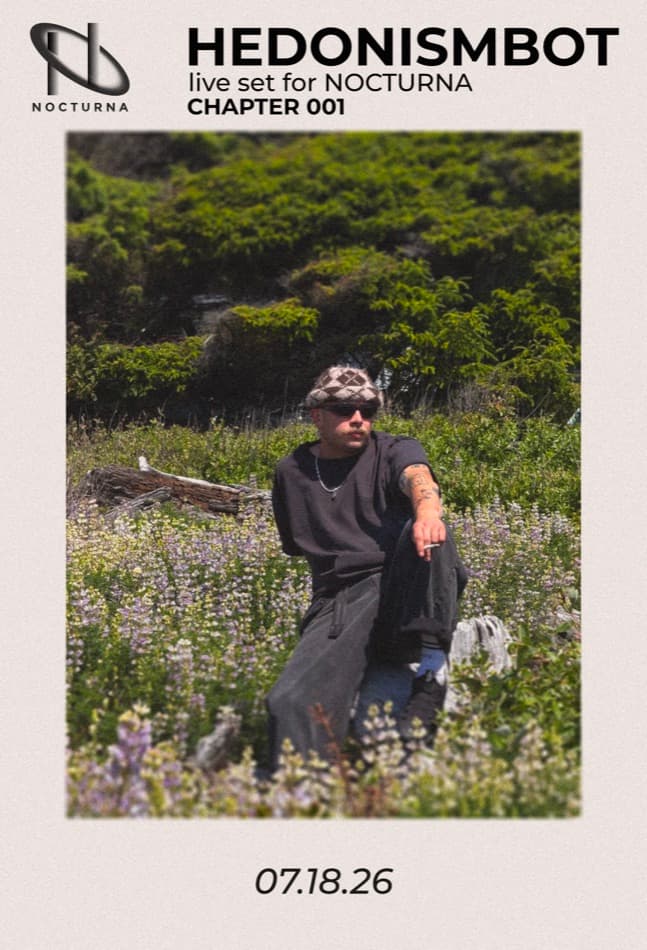
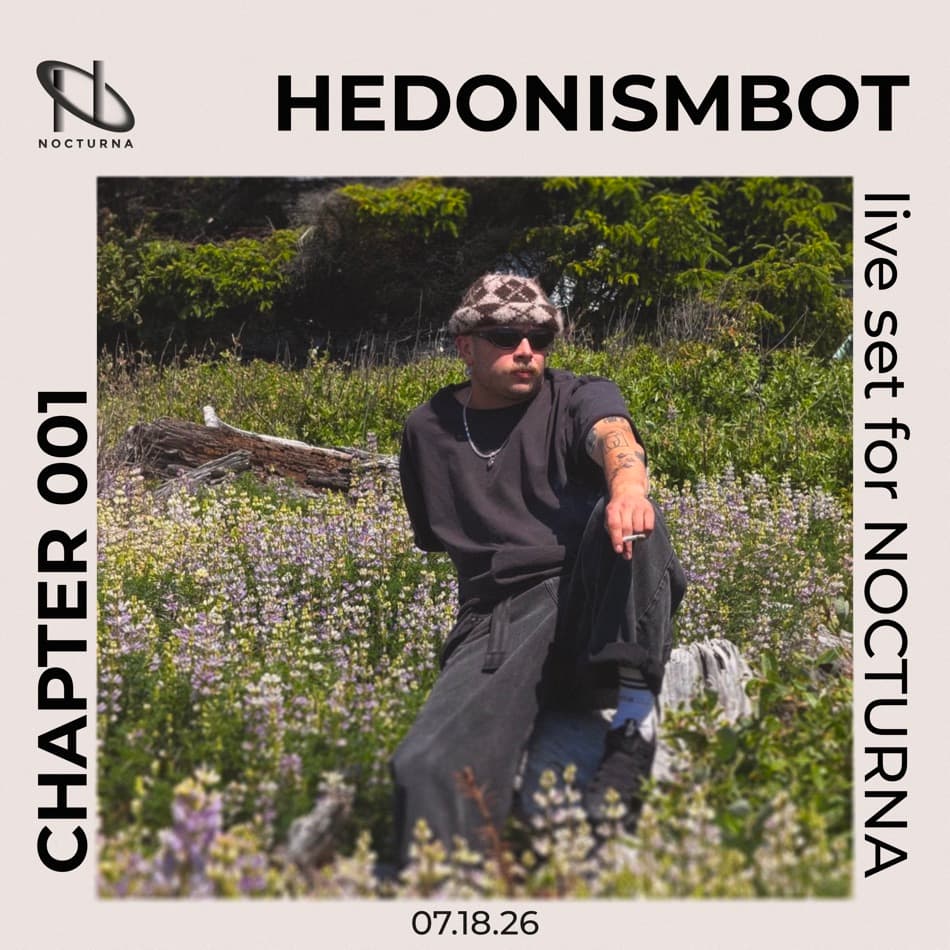
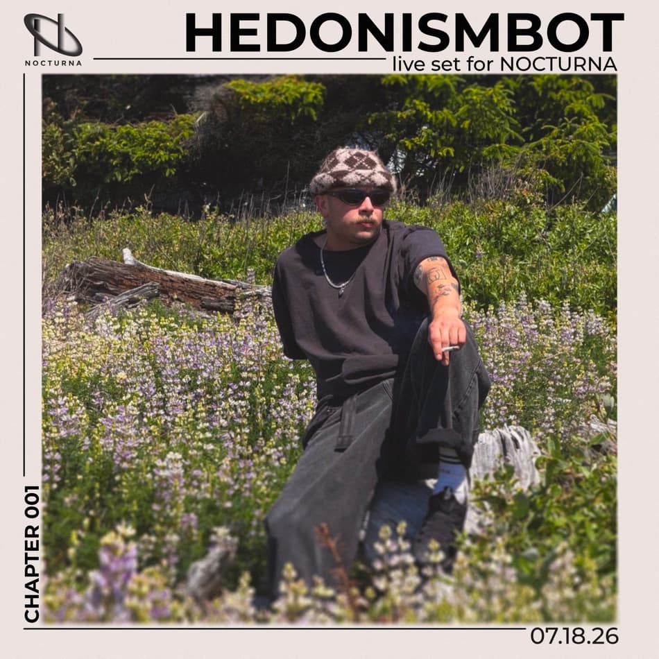
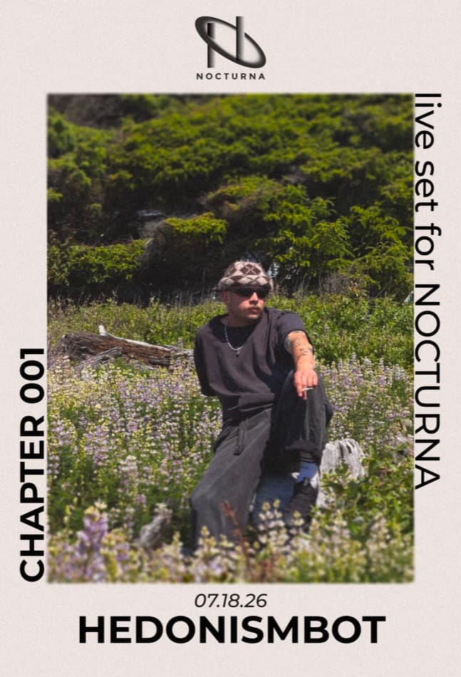
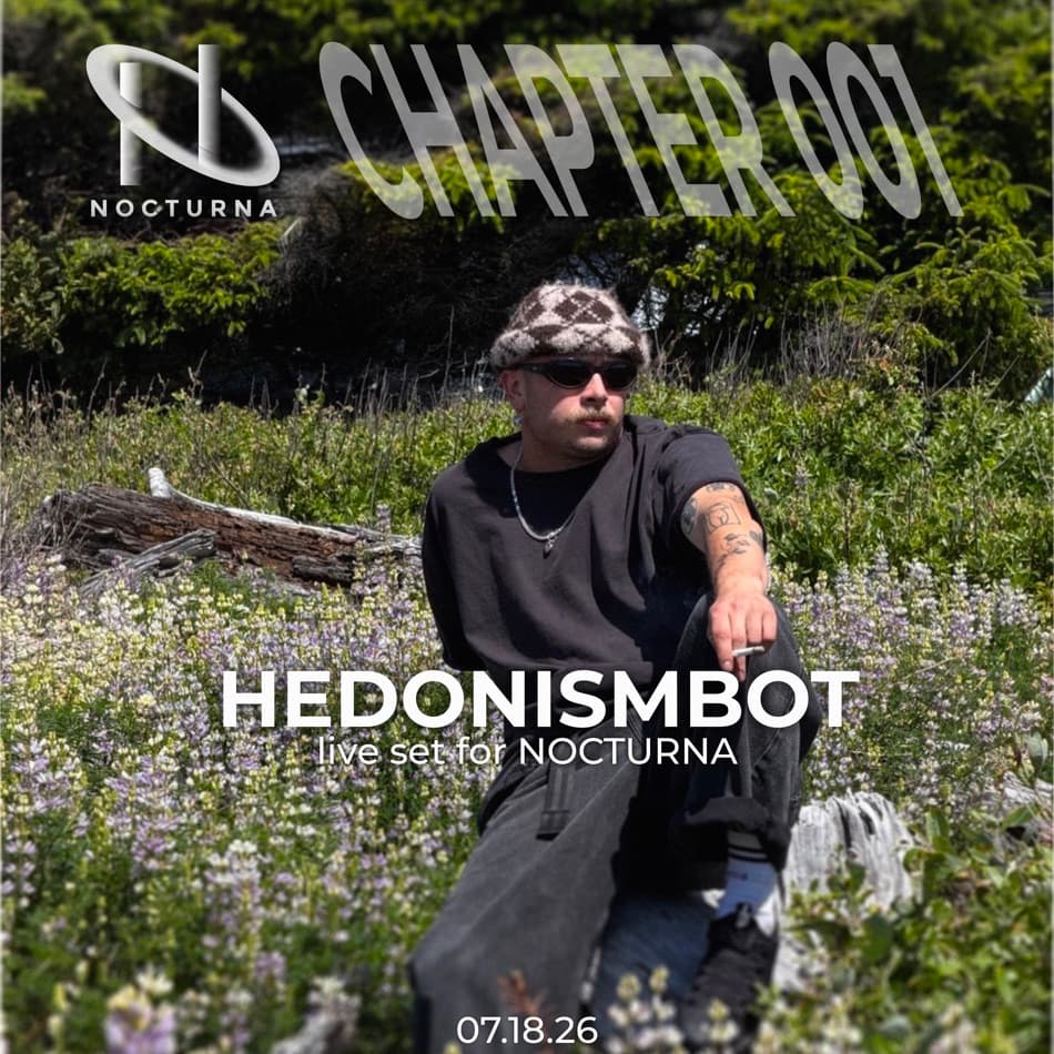
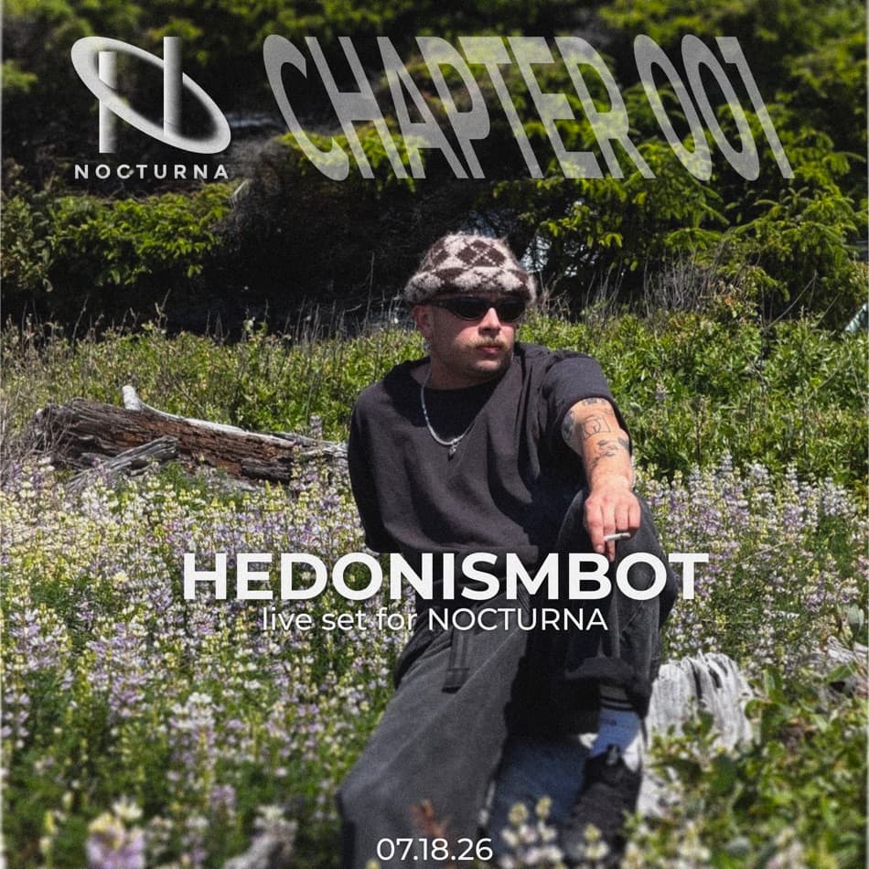
The full working set for one SoundCloud upload: Hedonismbot's live set for NOCTURNA, Chapter 001 — every layout pass from the first rough placements through to the refined selects, shown as they were made rather than narrowed down to a single final pick. Same photograph, same four elements (logo, chapter badge, artist name, date) tested in every arrangement until one held together.
Motion
Early motion concepts filmed on location — testing how the identity holds up moving, not just printed.
NOCTURNA taught me that a strong identity is not a logo or a collection of visuals — it is a system capable of evolving over time. The project shifted my approach from designing individual assets to designing relationships between typography, composition, motion, interaction, and atmosphere. That way of thinking continues to shape my work across branding, digital experiences, and creative direction.