The brief
Beauty Expert Summit 2026 is an international medical event bringing together ophthalmology, plastic and reconstructive surgery, and aesthetic medicine in Elche, Alicante. The work covers the summit's visual identity, digital communication, campaign assets, program presentation, speaker announcements, video materials, website direction, and sponsor-facing communication. The design challenge was building one coherent identity for three specialist fields without reducing the event to generic clinical imagery — something that reads as scientifically credible, internationally scaled, and premium to doctors, partners, sponsors, and attendees alike.
Color & type
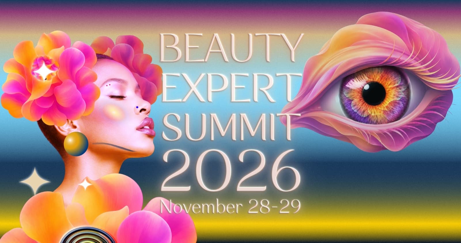
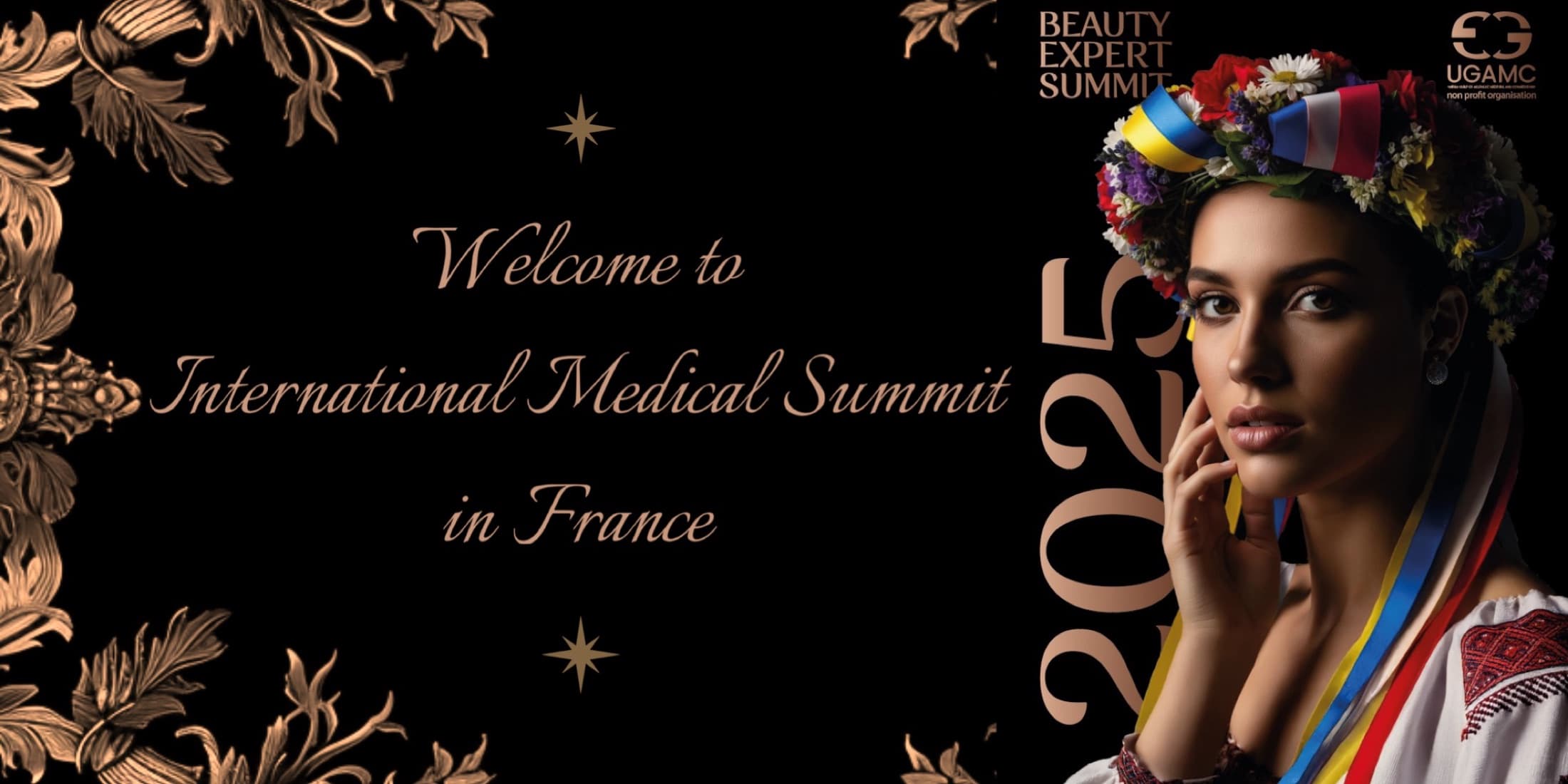
Deep navy and gold carry the weight of the system: blue reads as clinical and trustworthy without tipping into sterile hospital branding, and gold pushes it upmarket — legible instantly as a premium medical event rather than a generic conference. An engraved, high-contrast serif does the same double duty in type: elegant enough for a gala stage, precise enough to sit next to a clinical diagram without turning decorative. The one deliberate departure is the key visual itself — a warm, saturated floral portrait against the otherwise restrained navy-and-gold system — kept because aesthetic medicine is, underneath the science, still about how people want to look and feel. The gold-on-navy discipline just gives that warmth somewhere credible to land.
The key visual, as a poster
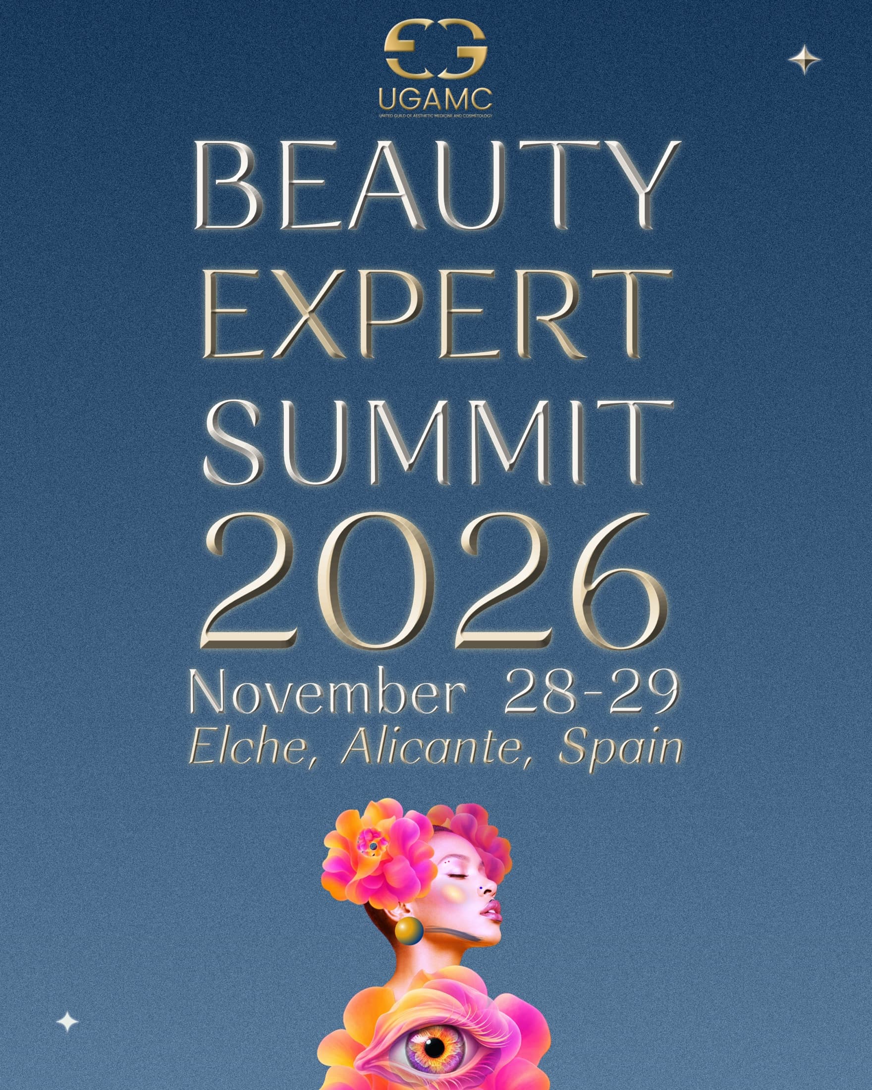
The same character-and-eye artwork, restated as the primary event poster — gold-embossed serif type over a deep blue field, built for print and venue signage rather than a feed.
Brand manifesto
A short film stating what the identity is for, in the summit's own voice rather than a mood board — press play for sound.
Honest status
Because the event hasn't taken place yet, this case study focuses on the design system, campaign development, and production process rather than claiming final outcomes. Photography and results will be added after November 2026.
Campaign in application
The same gold-on-blue system extended across the channels doctors, partners, and sponsors actually encounter it in — a dimensional key visual for the periorbital and refractive-surgery track, social banners sized for LinkedIn and Facebook, and the summit's own website.

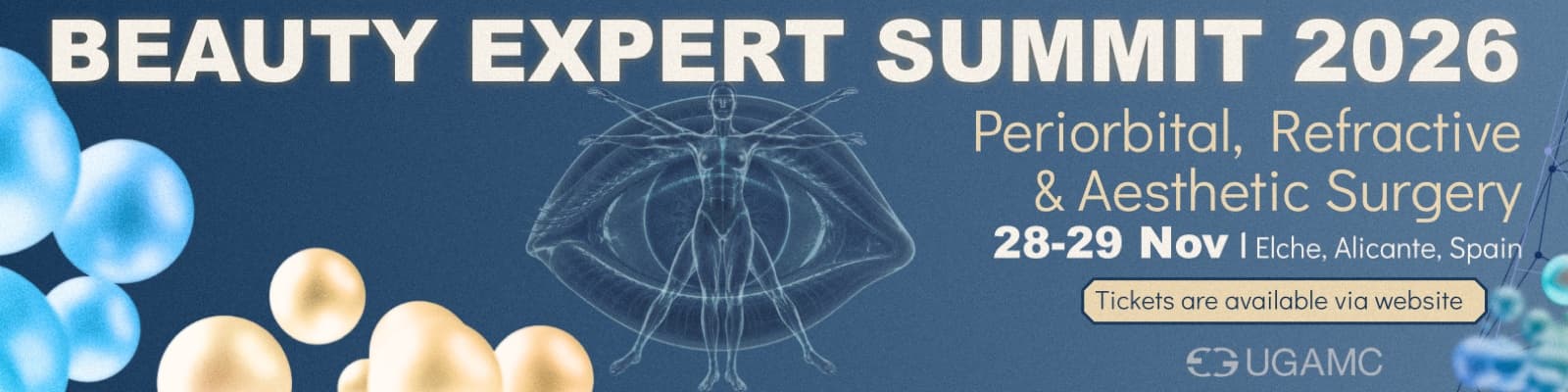
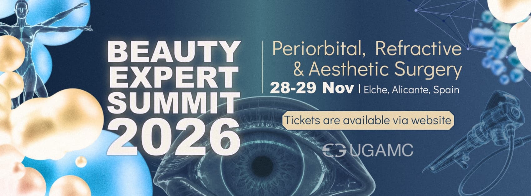
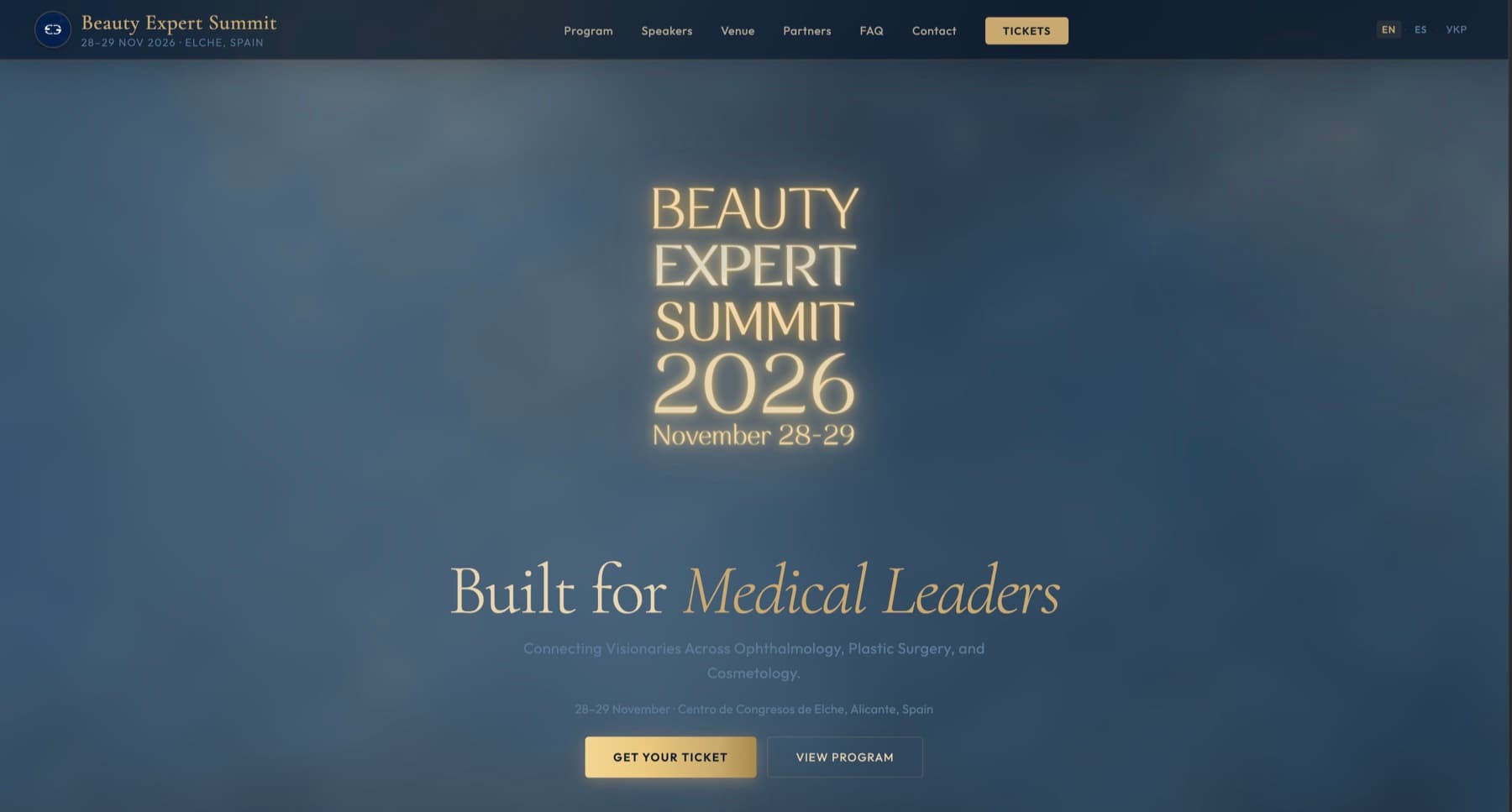
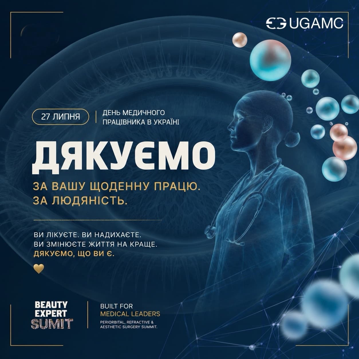
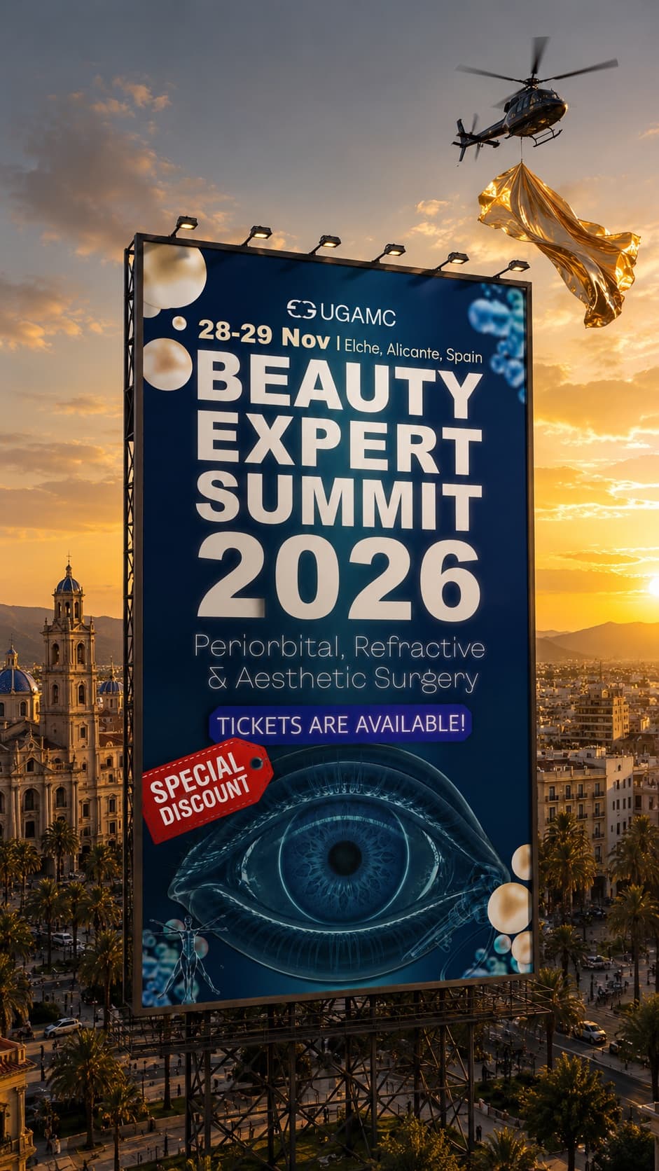
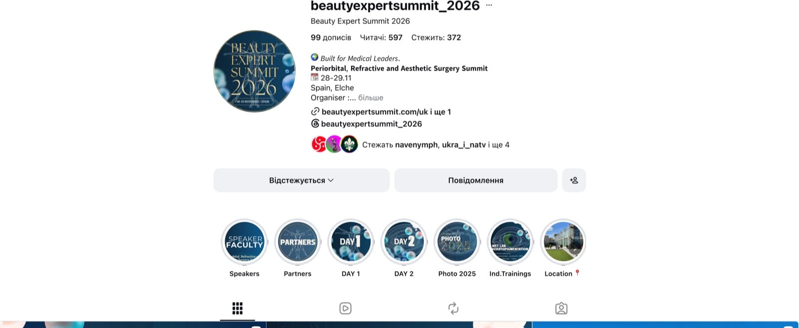
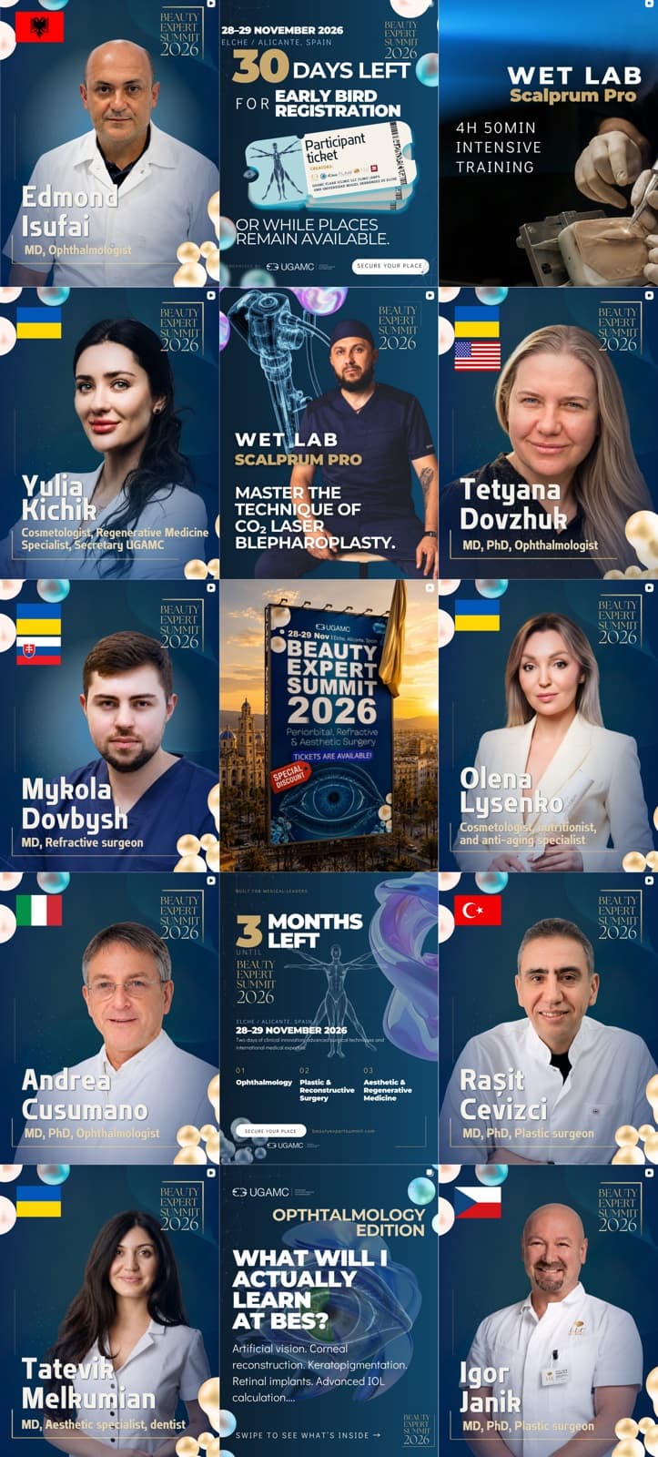
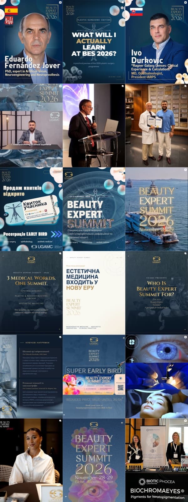
The same gold-on-blue system holds up at feed-grid scale — speaker announcements, countdowns, and campaign posts reading as one cohesive account rather than a scattered mix of one-off graphics, at @beautyexpertsummit_2026.
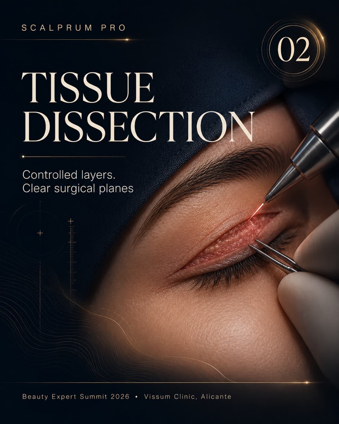
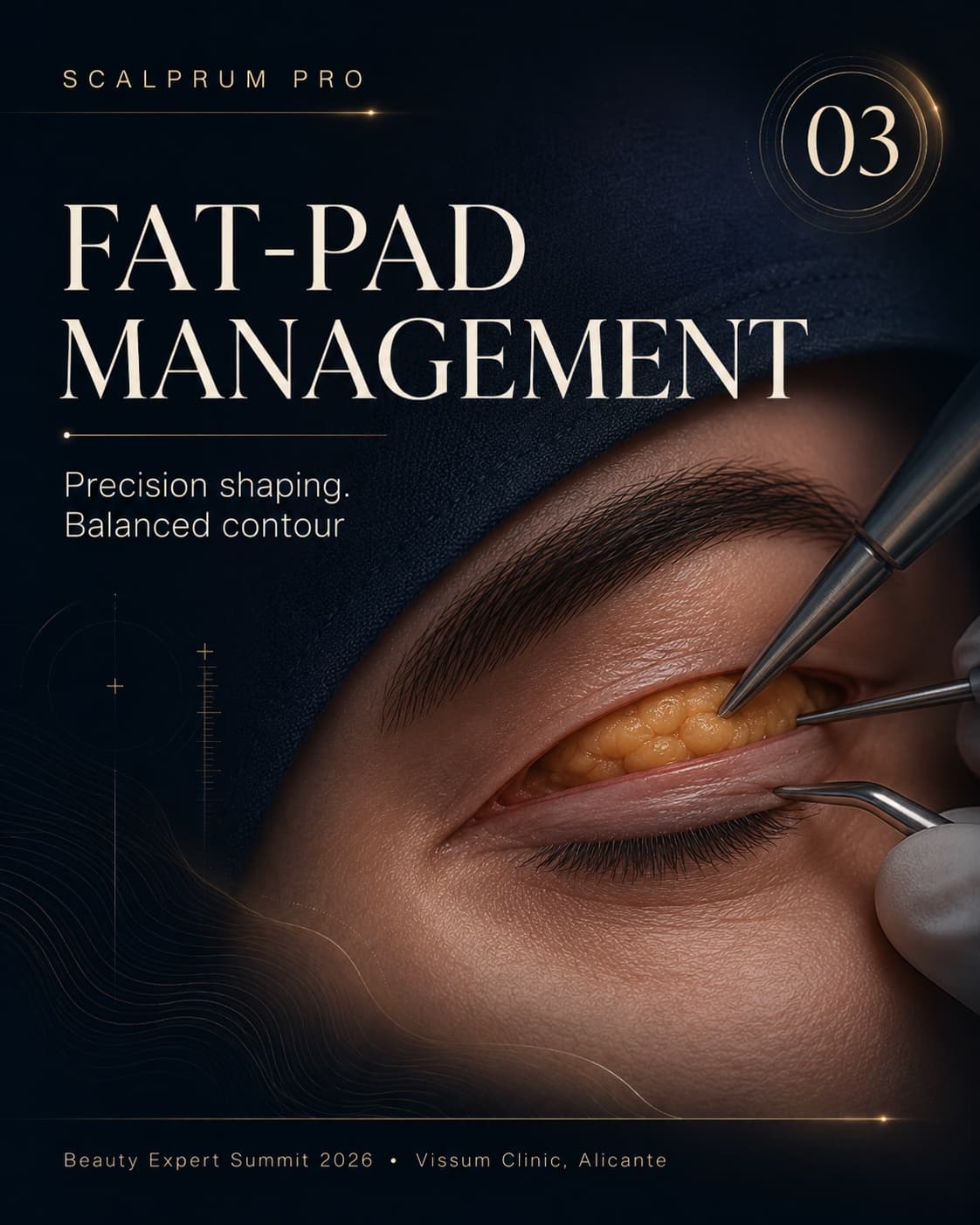
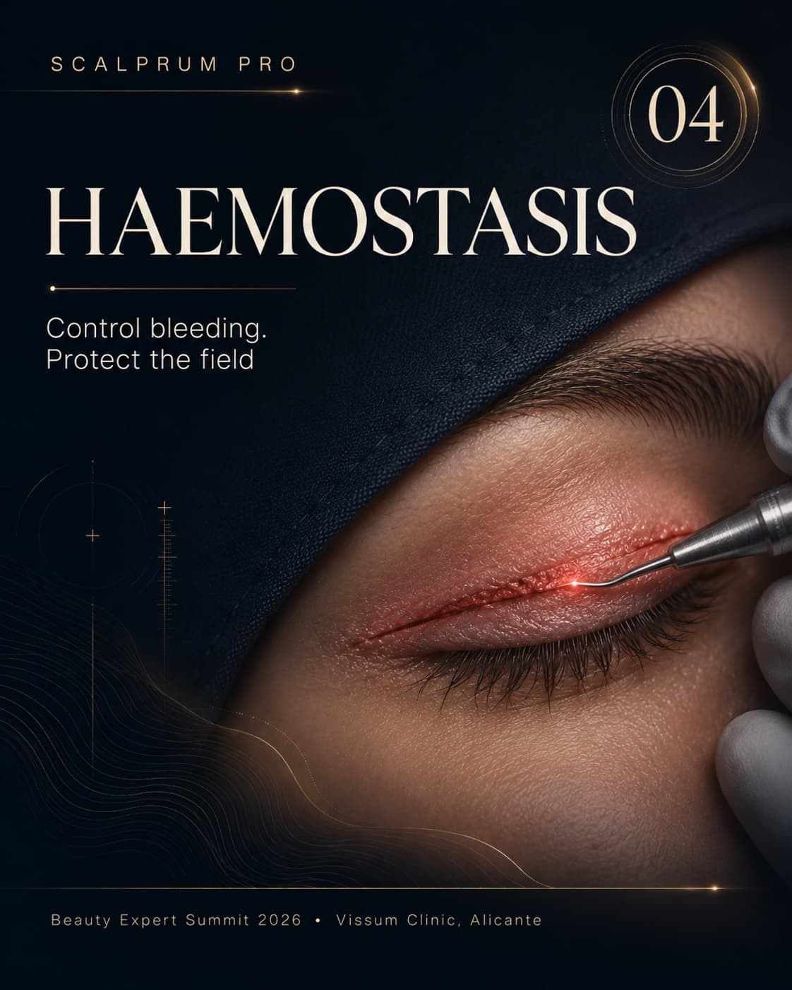
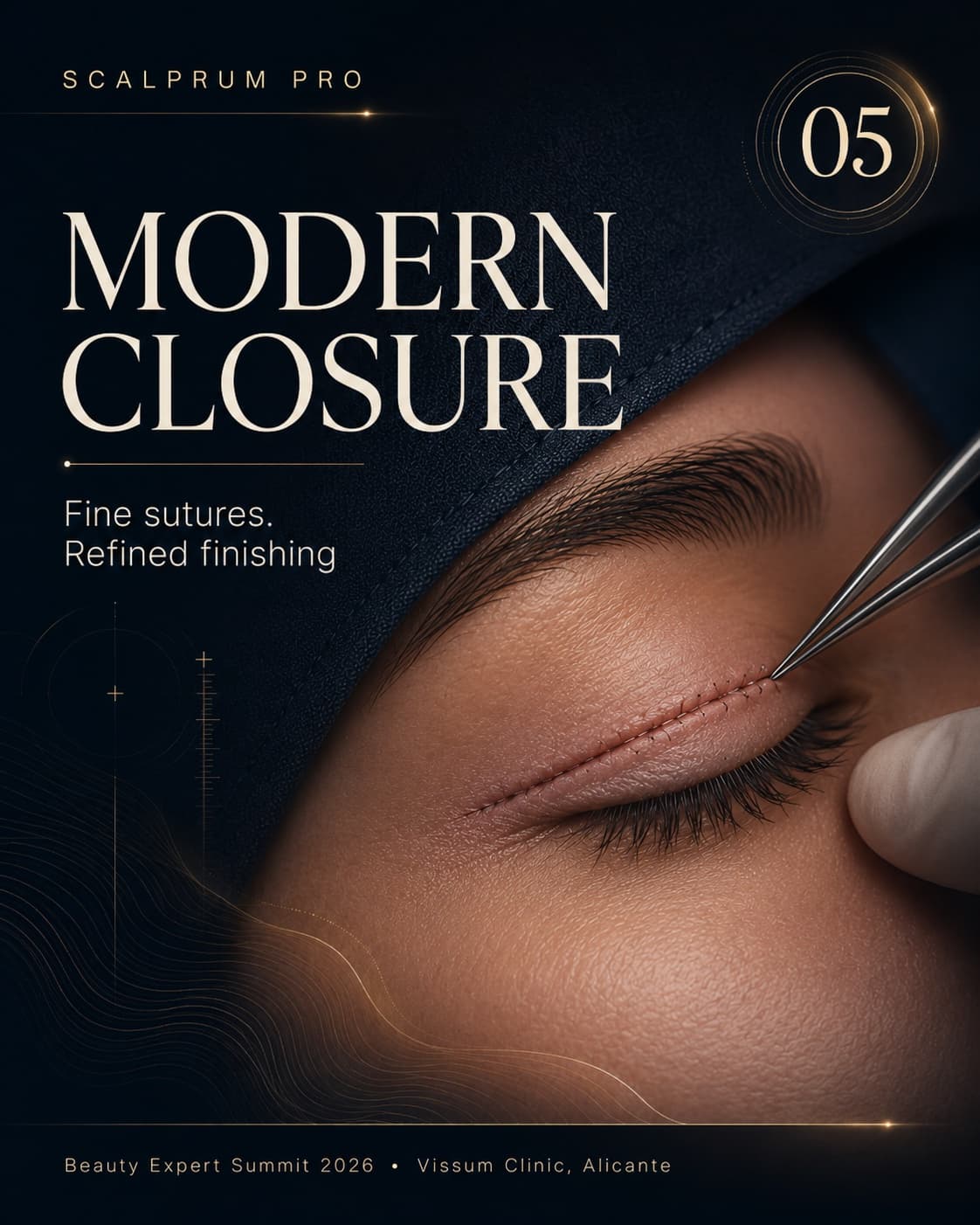
Scalprum Pro — wet lab series
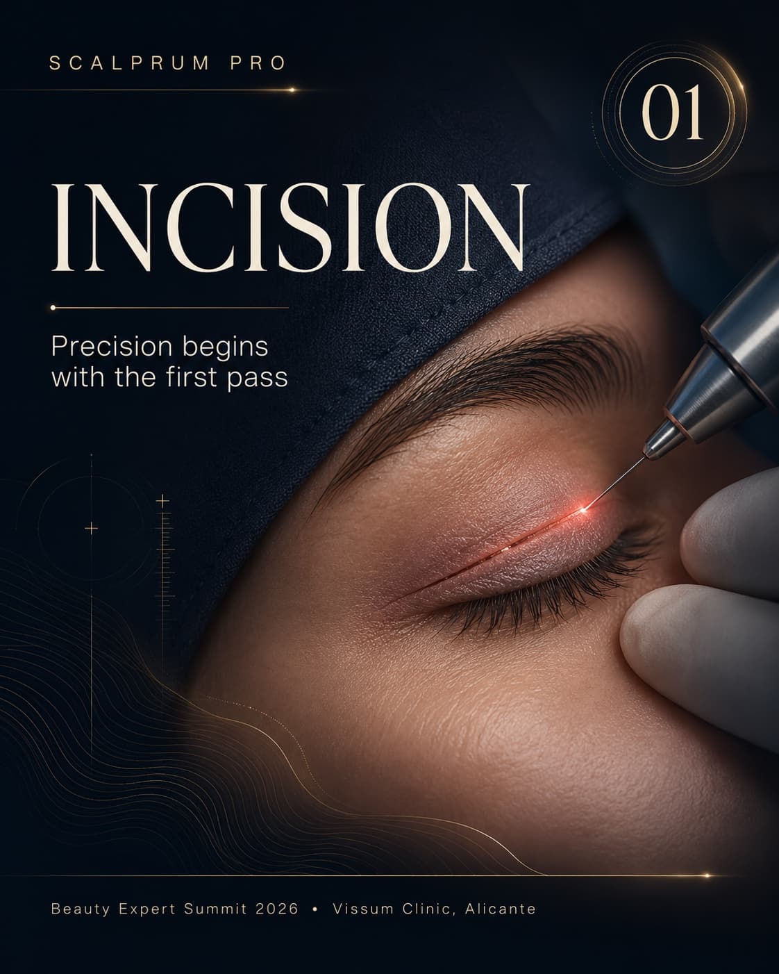
A five-step procedural poster series for the Wet Lab track's live blepharoplasty training at Vissum Clinic — incision through closure, each step numbered and captioned on the same gold-on-navy system as the rest of the identity, over real macro surgical photography.
The science, explained
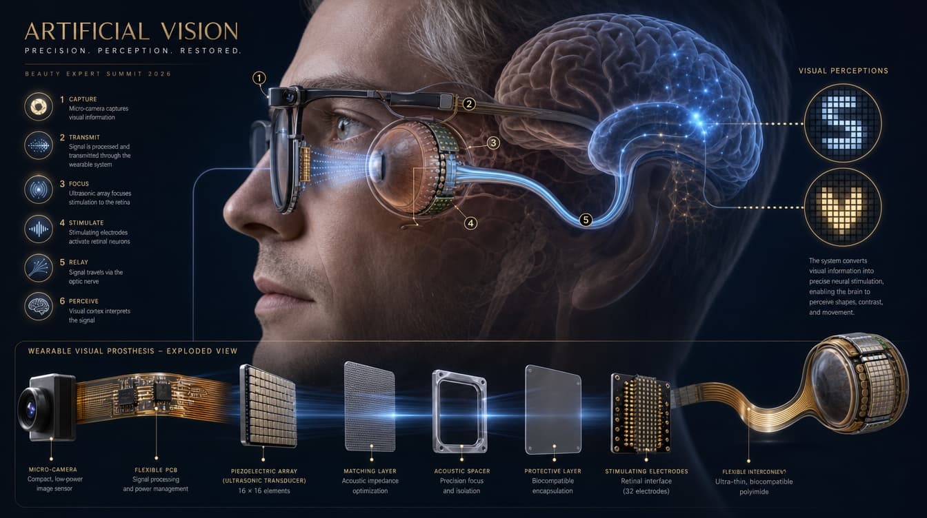
Program content has to work harder than a poster. This ophthalmology-track infographic — a wearable visual-prosthesis system, walked through in six numbered steps and an exploded hardware breakdown — carries the same gold-on-blue system into dense, technical territory without losing it.
Specialty marks
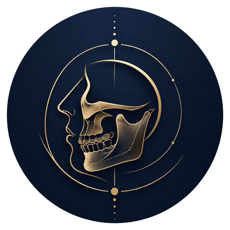
Three engraved gold-line symbols carry the identity down to program level — one mark per specialist track, built on the same circular, compass-like framing as the eye motif in the key visual.


This is the project where I had the least room to hide behind atmosphere — medical, international, multi-specialty audiences read credibility fast, and a wrong typographic or color decision costs trust immediately. Holding gold-on-blue restraint against the temptation to over-decorate has been the real design problem, more than any single asset.